

SAP Sustainability Navigator
When SAP came to us for this project, their current Sustainability Navigator was slow, cluttered, and outdated. We were tasked with reorganizing this web app in a way that was cleaner, fresher, interactive, self-guided, and was an experience the user/customer could easily follow along to, which would ultimately guide them to improving their sustainability practices at their company.
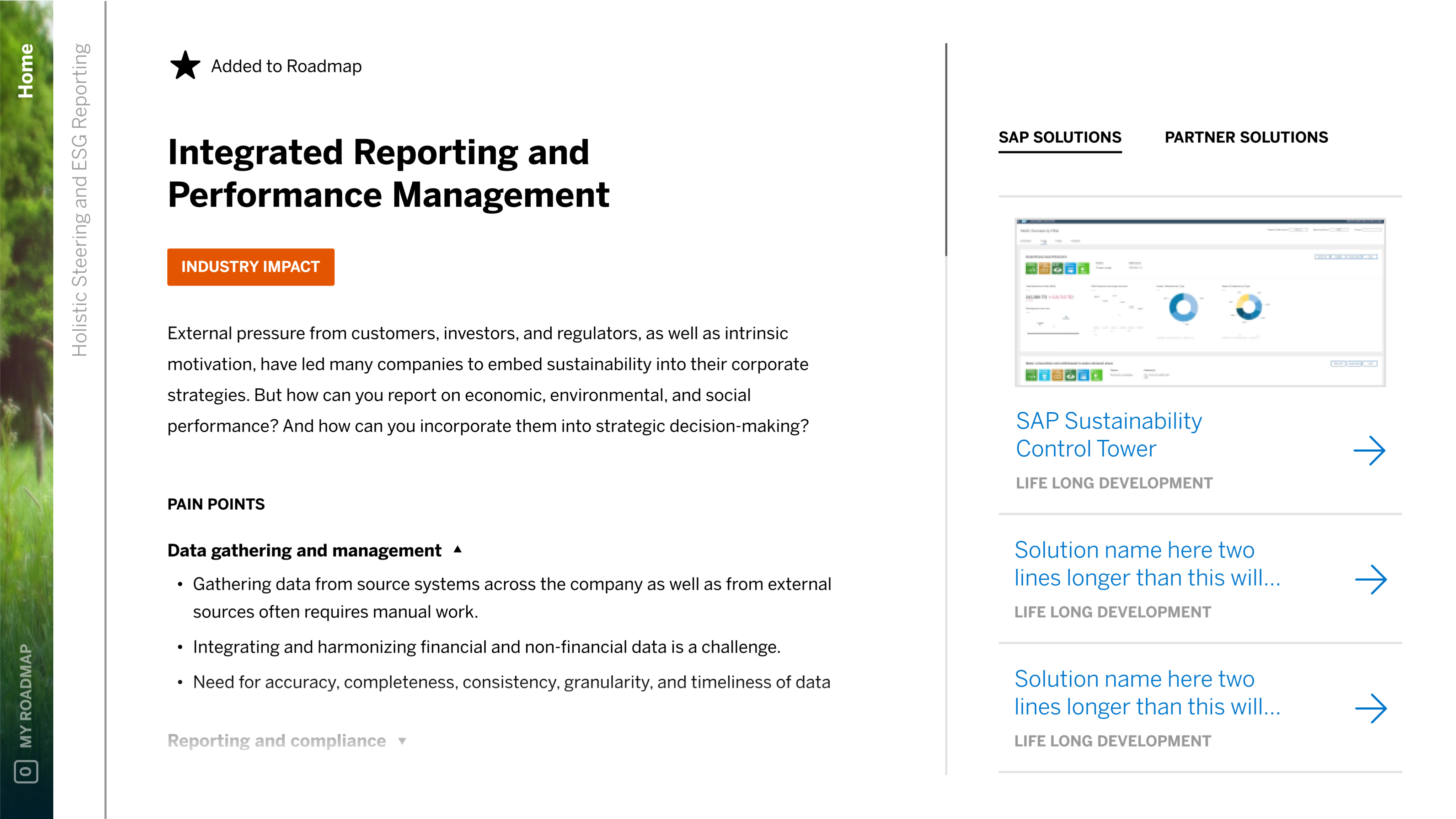
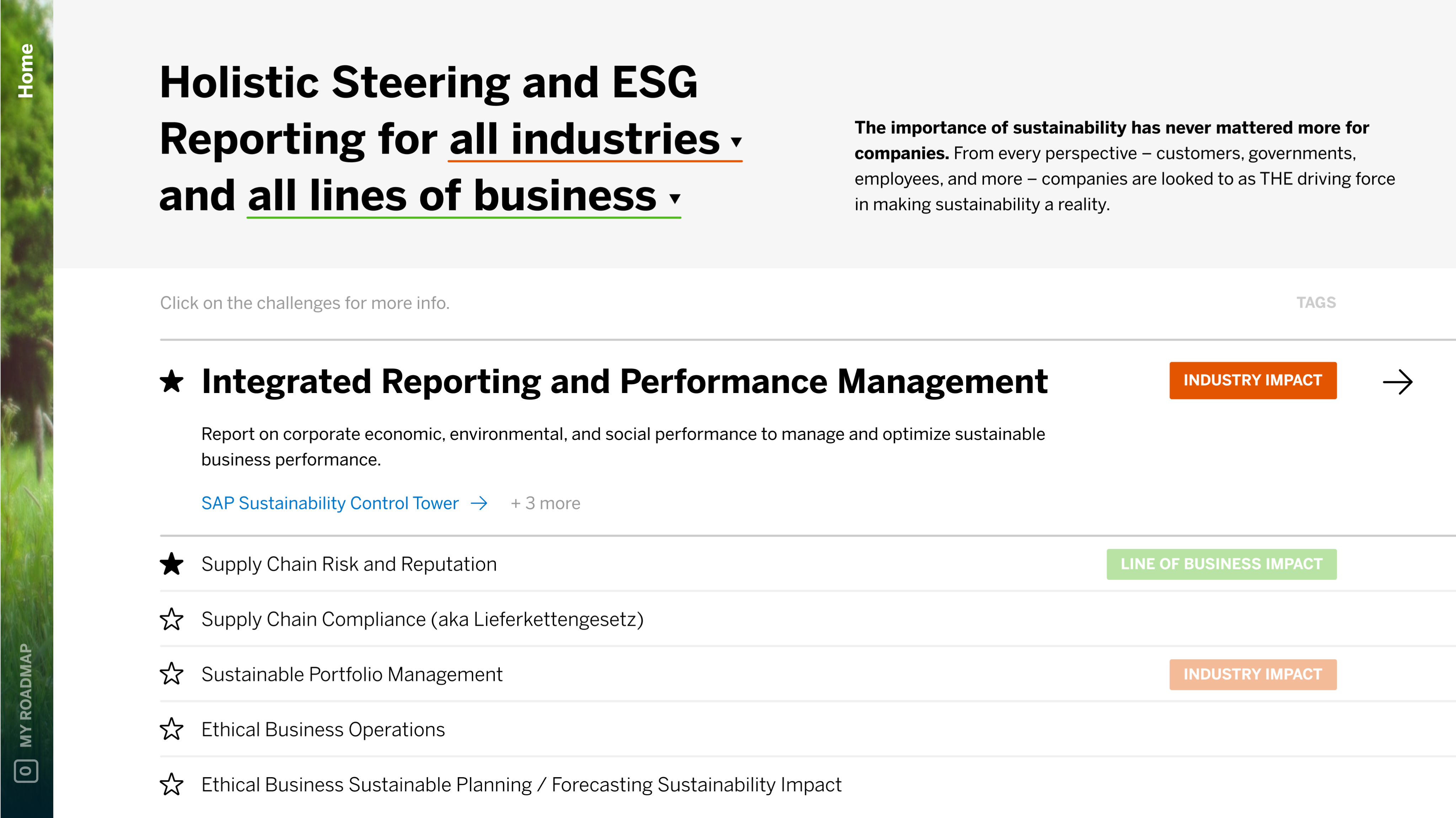
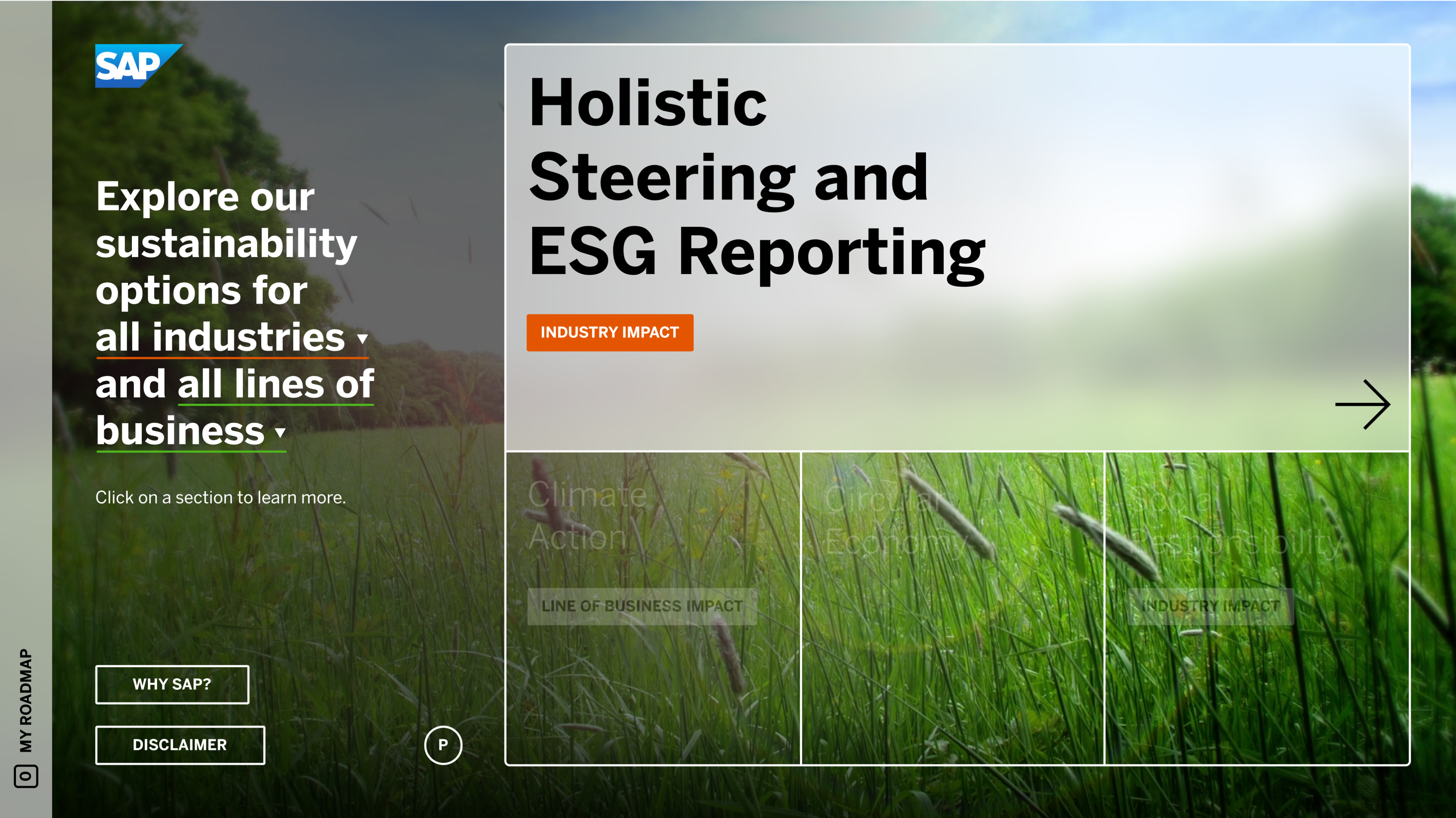
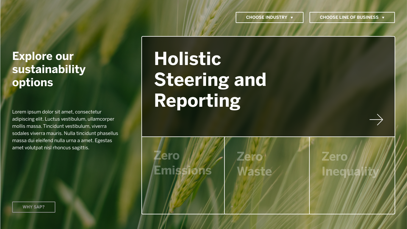
Style Frames
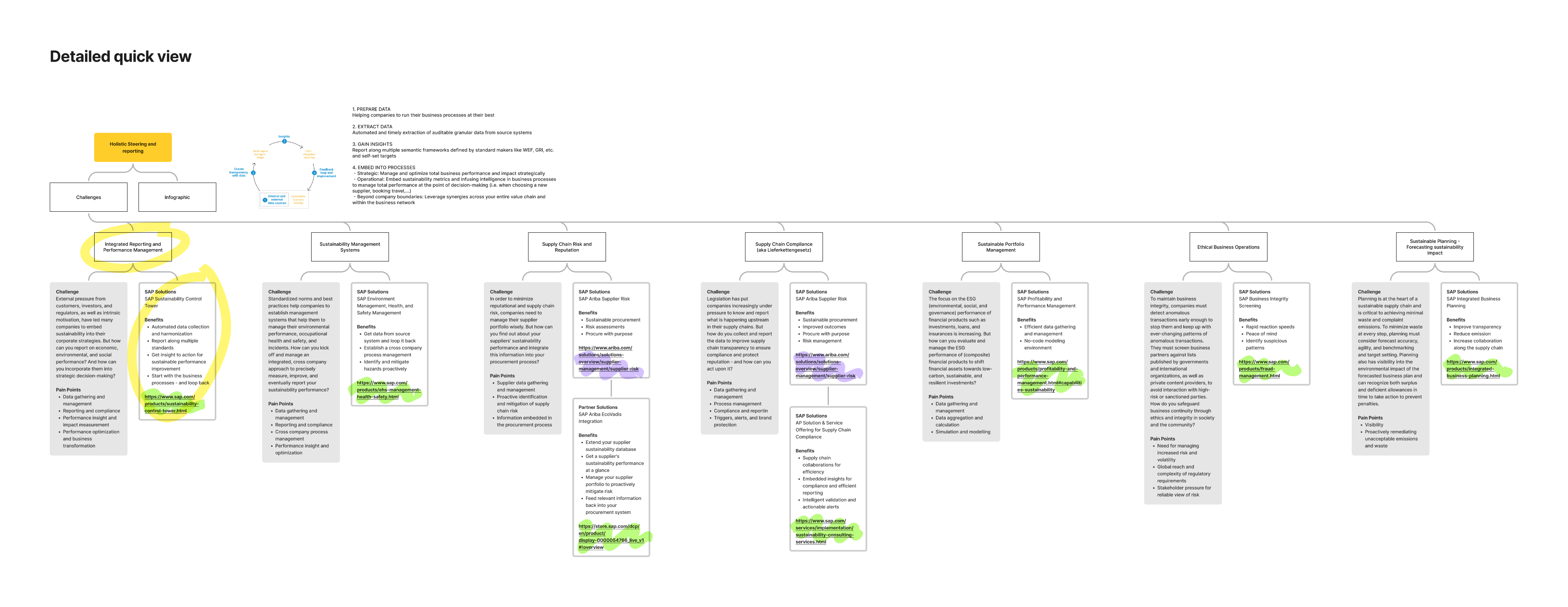
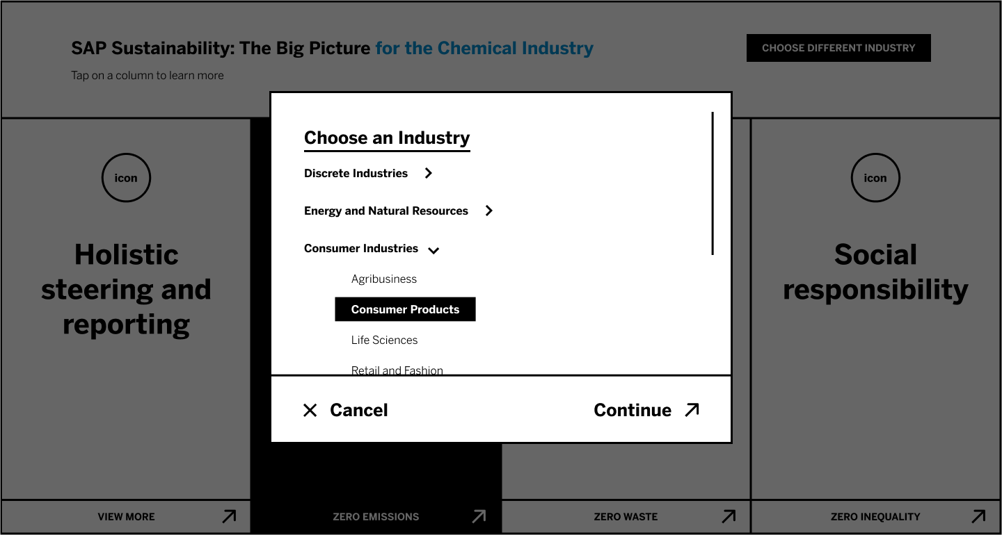
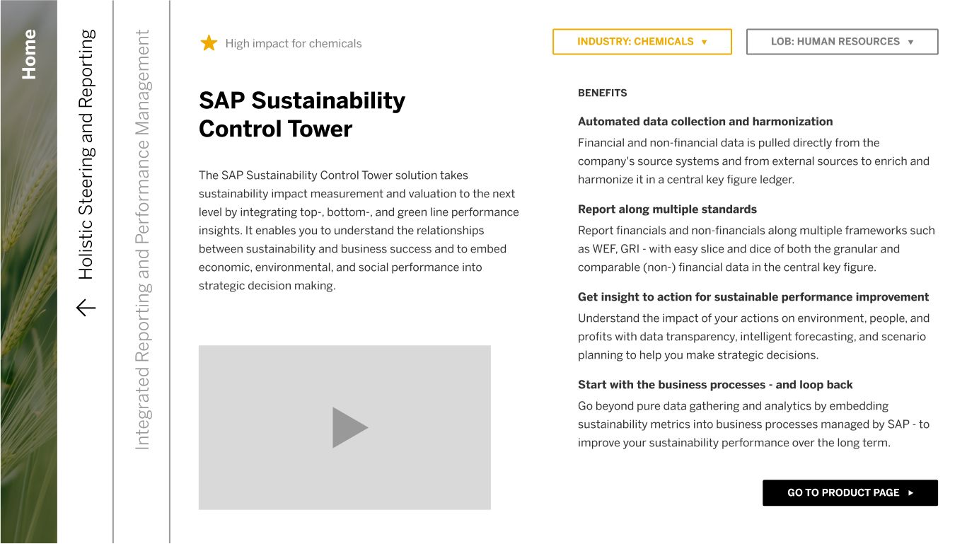
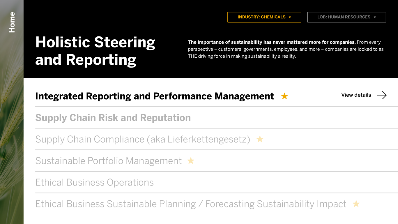
Our final design was a horizontal, folder-like flow. New pages entered in from the right side, which means we were able to maximize our use of space and have a navigation that was uncluttered and easy to understand. We designed every version of a page, which was then populated by programmers on SAP’s team.

Web maps
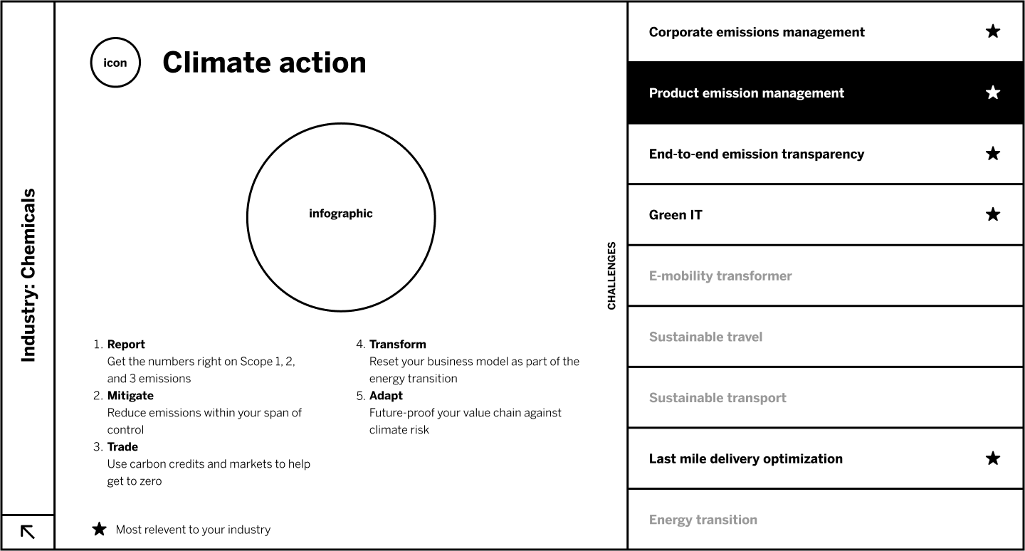
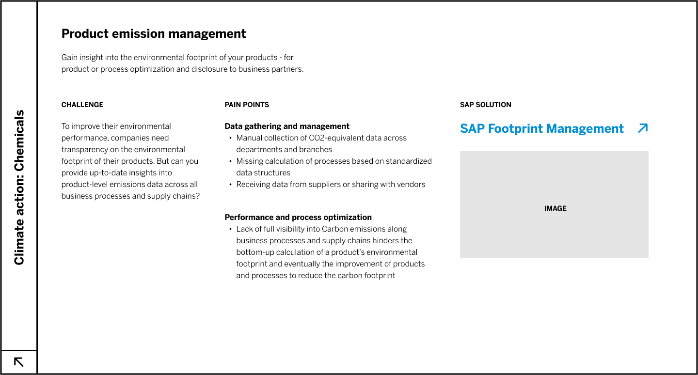
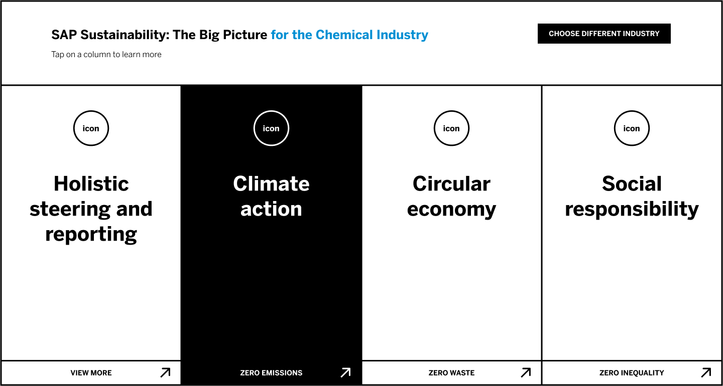
This is a small snippet of some of the preliminary work we did before designing the dashboard. We made multiple web maps of different fidelity to get a better feeling for every aspect of the site and to understand where we could simplify actions and minimize clicks.
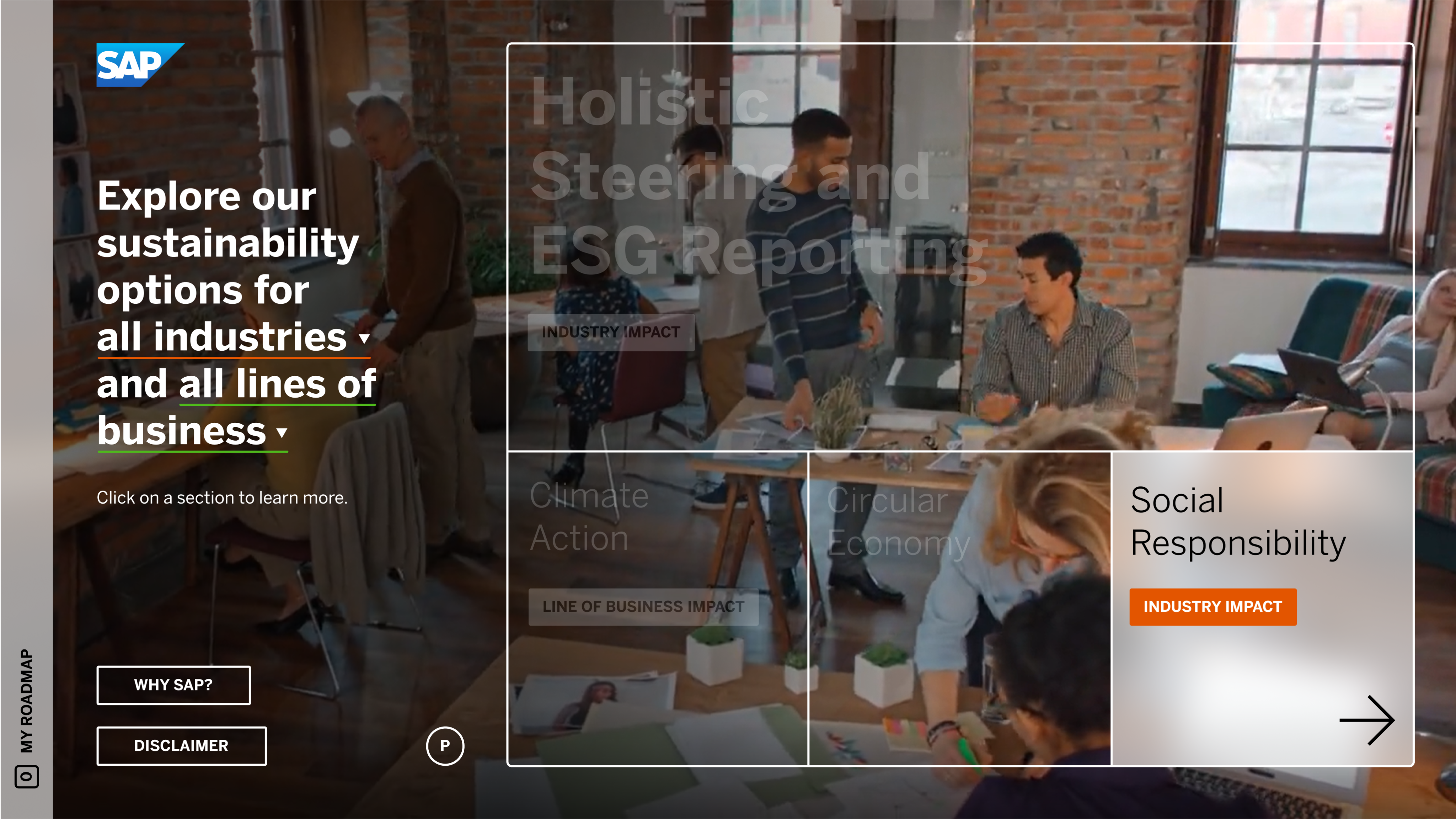
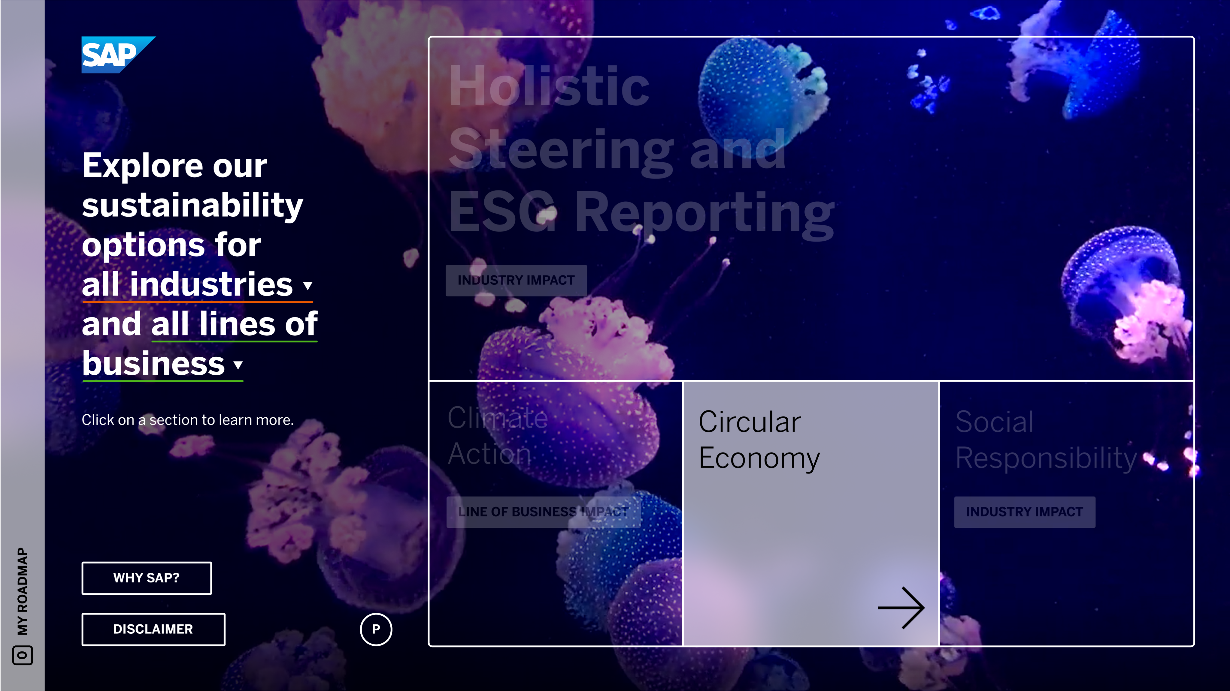
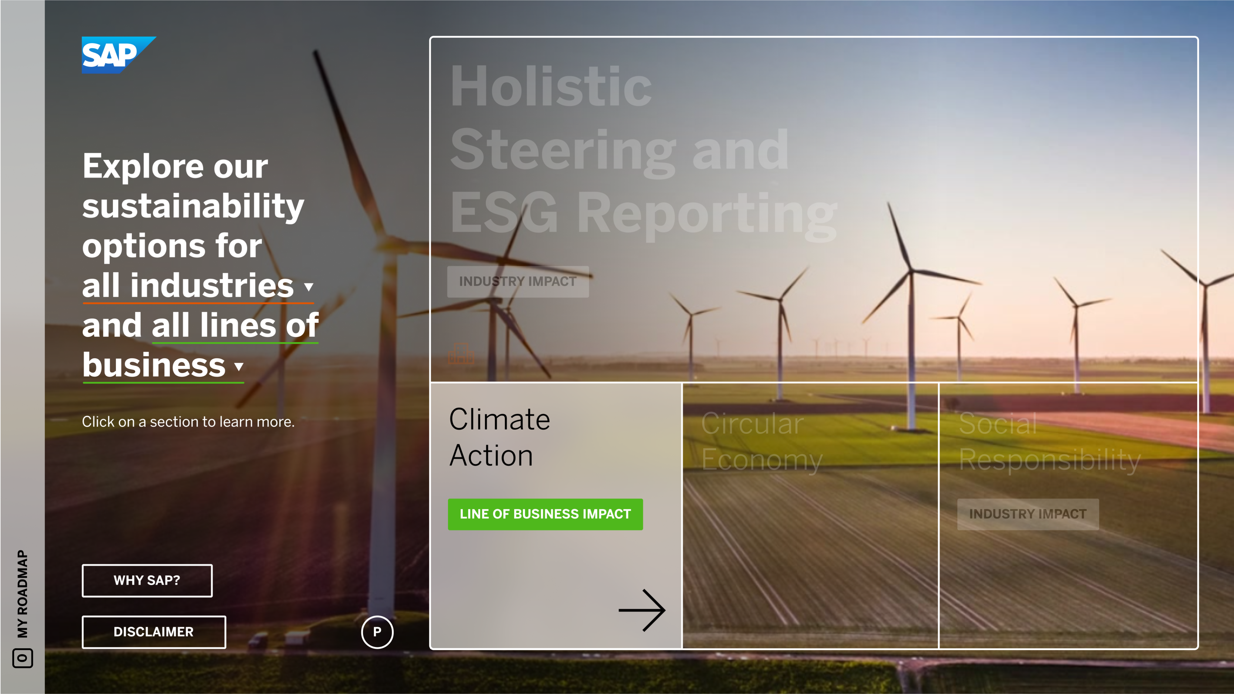
Previous versions
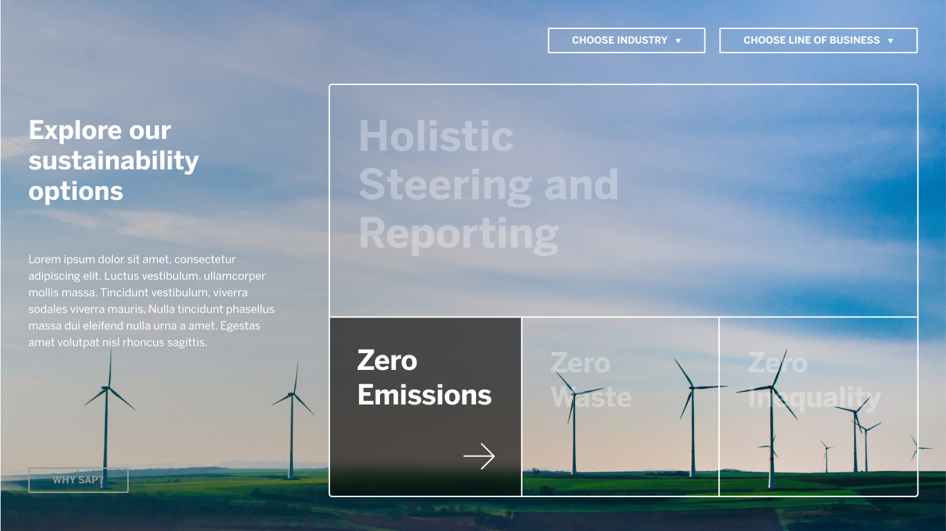
We did multiple iterations of design, and here are two early versions that got us close to our final product. The black and white top version is one of the first versions I designed which utilized a form of vertical tabbing and sectioning the information similar to what ended up being the final. The lower version is our prefinal layout which I enjoyed design-wise due to it’s simplicity and full screen photography.
© Elizabeth Mason 2025. All Rights Reserved.
home
contact
honorable mentions

SAP Sustainability Navigator
When SAP came to us for this project, their current Sustainability Navigator was slow, cluttered, and outdated. We were tasked with reorganizing this web app in a way that was cleaner, fresher, interactive, self-guided, and was an experience the user/customer could easily follow along to, which would ultimately guide them to improving their sustainability practices at their company.
Style Frames
Our final design was a horizontal, folder-like flow. New pages entered in from the right side, which means we were able to maximize our use of space and have a navigation that was uncluttered and easy to understand. We designed every version of a page, which was then populated by programmers on SAP’s team.

Web maps
This is a small snippet of some of the preliminary work we did before designing the dashboard. We made multiple web maps of different fidelity to get a better feeling for every aspect of the site and to understand where we could simplify actions and minimize clicks.
Previous versions
We did multiple iterations of design, and here are two early versions that got us close to our final product. The black and white top version is one of the first versions I designed which utilized a form of vertical tabbing and sectioning the information similar to what ended up being the final. The lower version is our prefinal layout which I enjoyed design-wise due to it’s simplicity and full screen photography.
© Elizabeth Mason 2025. All Rights Reserved.