Hearts On Fire
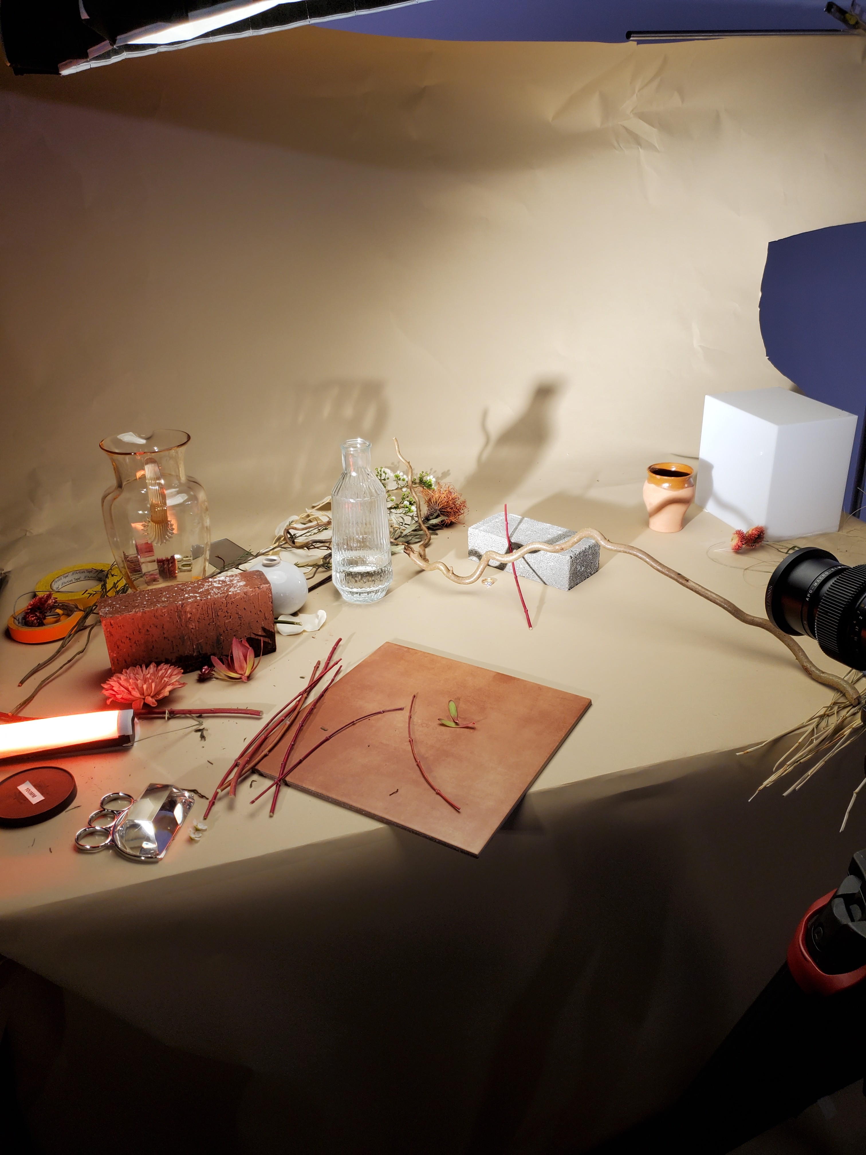
Hearts On Fire is a luxury jewelry company based in Boston. They had come to Indigo Slate looking for a website refresh using their new rebrand. While working on the site, we saw an opportunity to push their photography guidelines, so we staged a test photoshoot and hit the ground running. What resulted was two weeks worth of planning and 3 days experimenting on set, to bring this new angle of their brand to life.
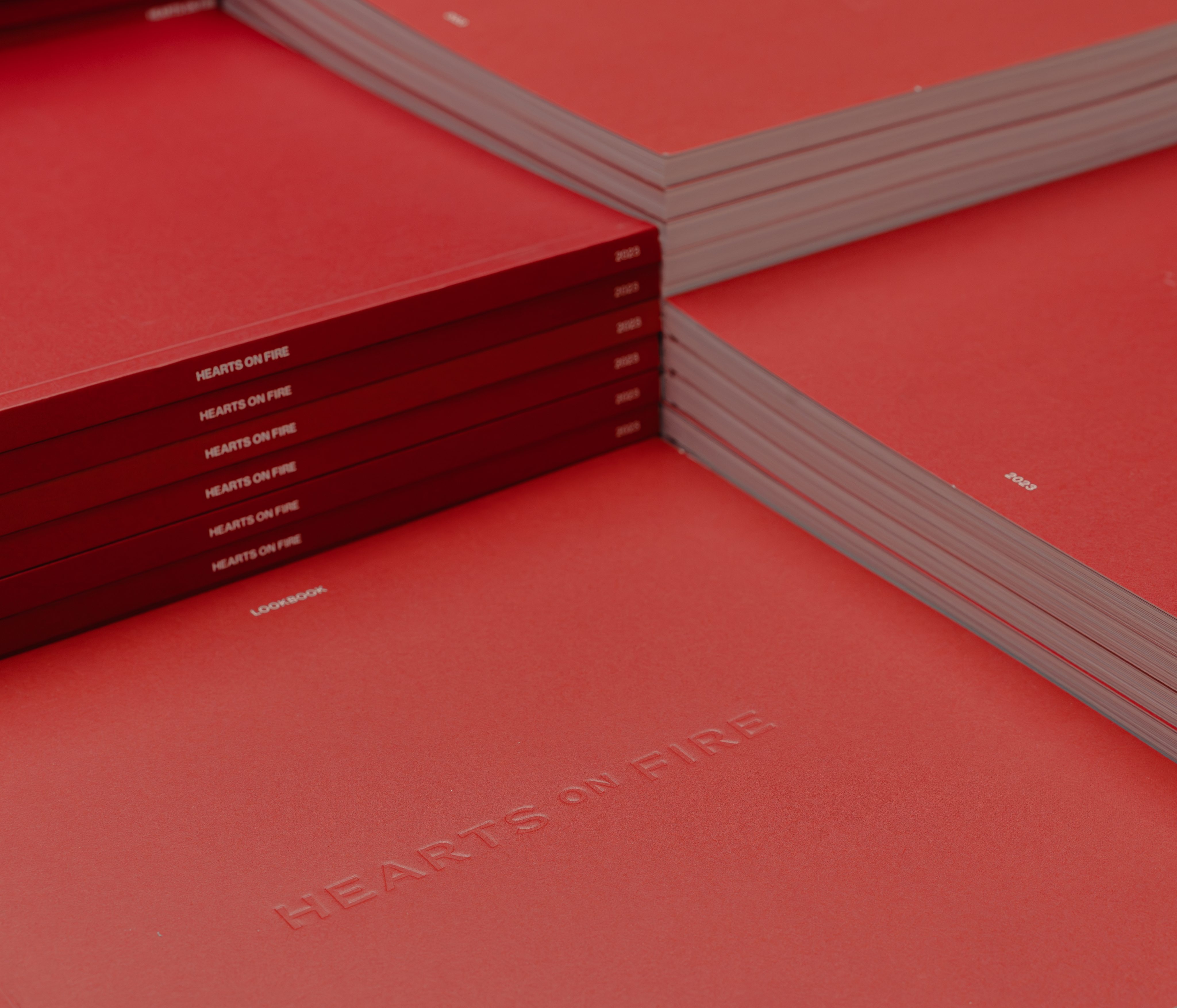
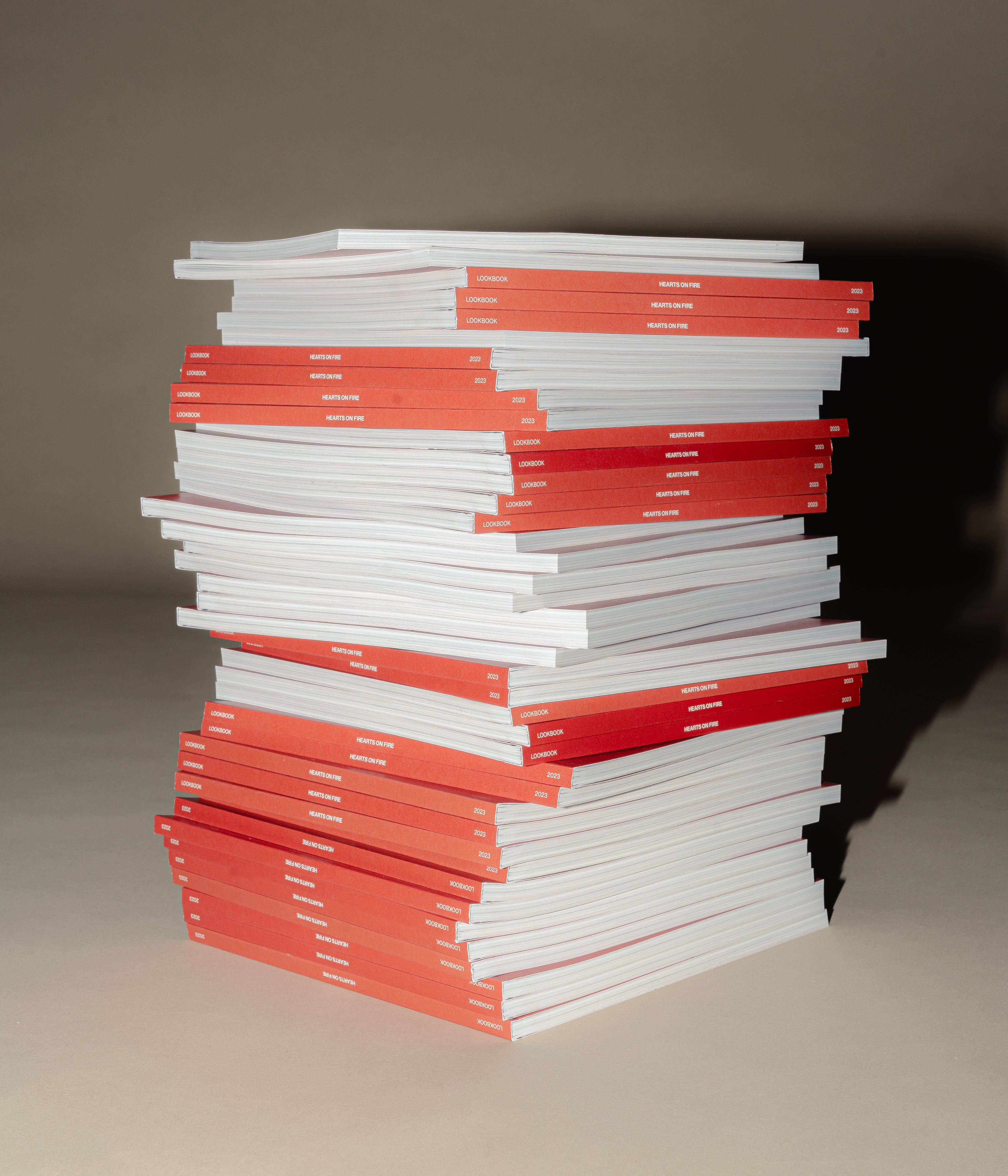
After the photoshoot was finished, we topped it off with an elegant look book that explained our strategic thinking around the photography, and listed the tools and materials we used to make it happen.
See their website
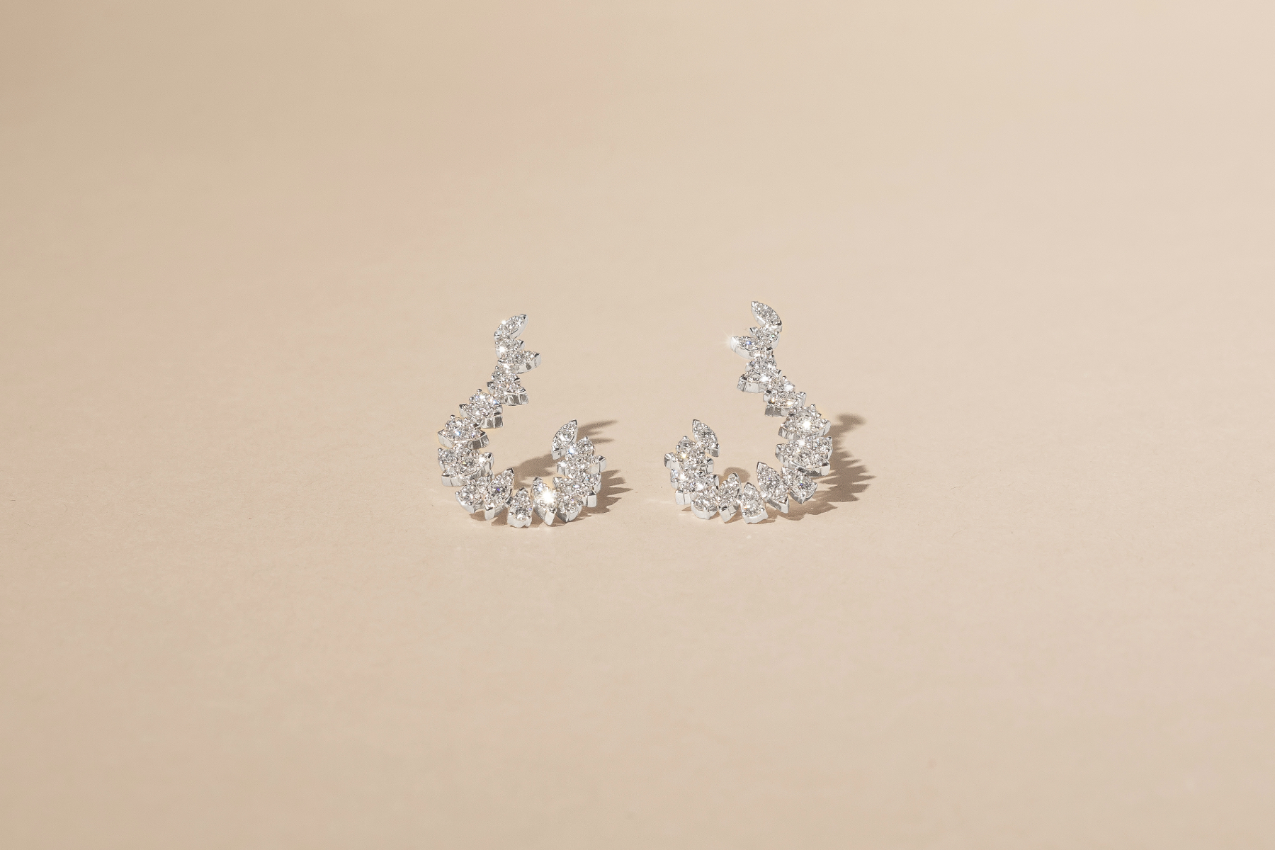
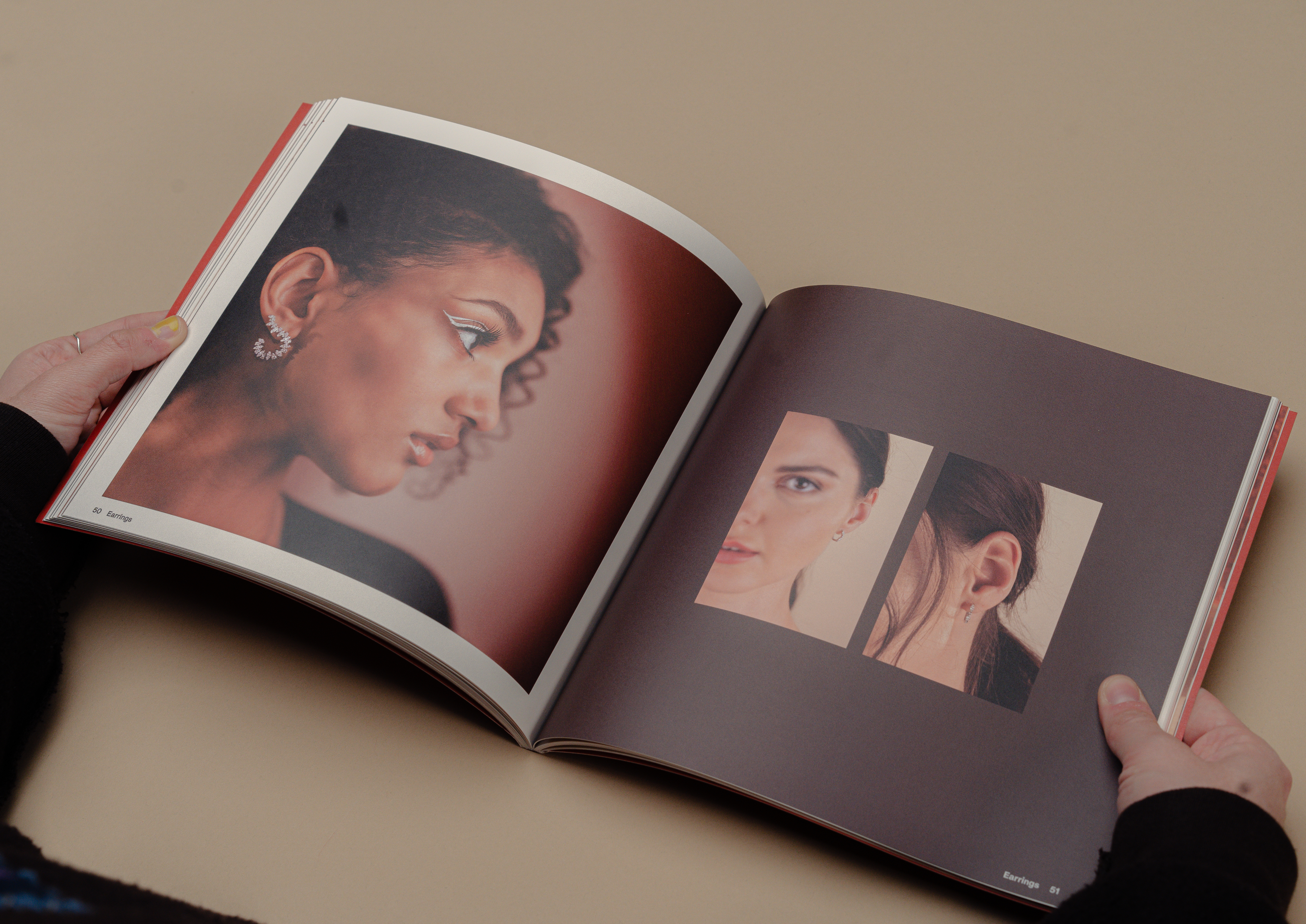
Excite
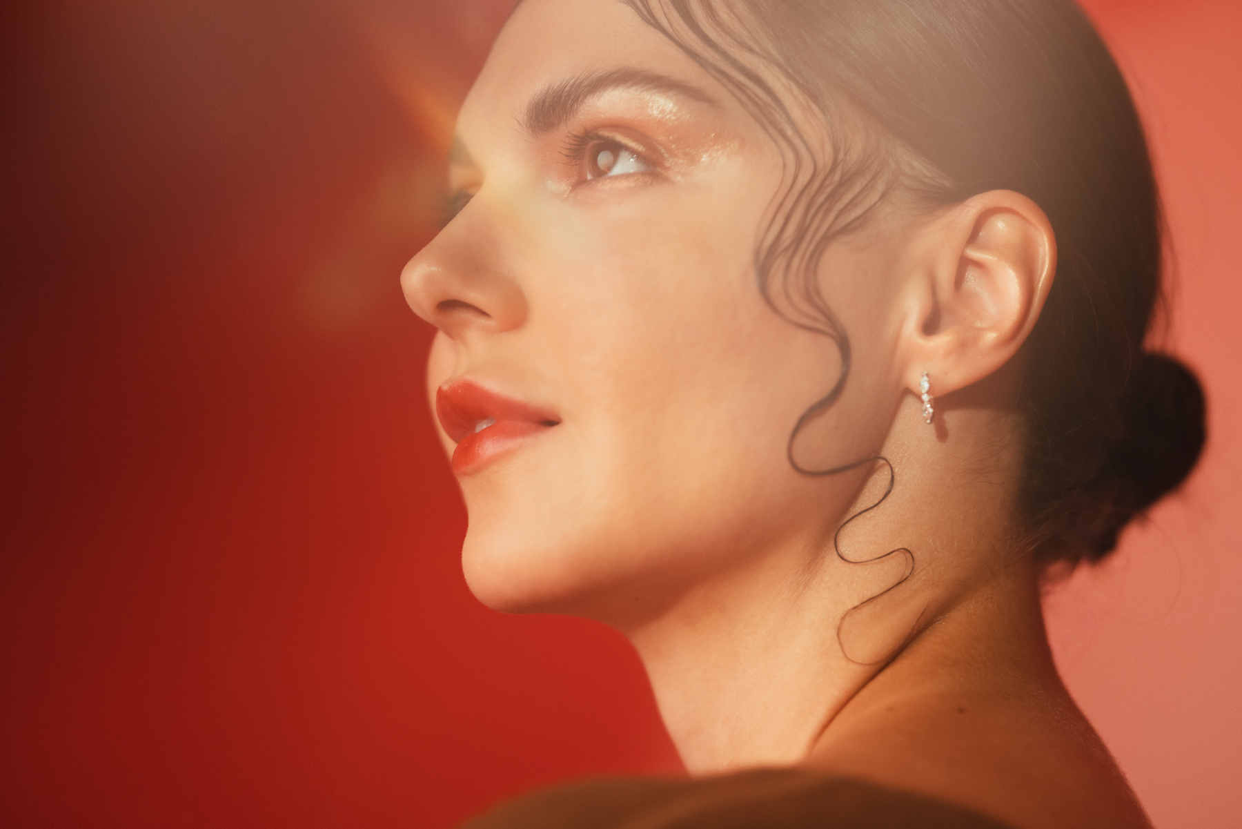
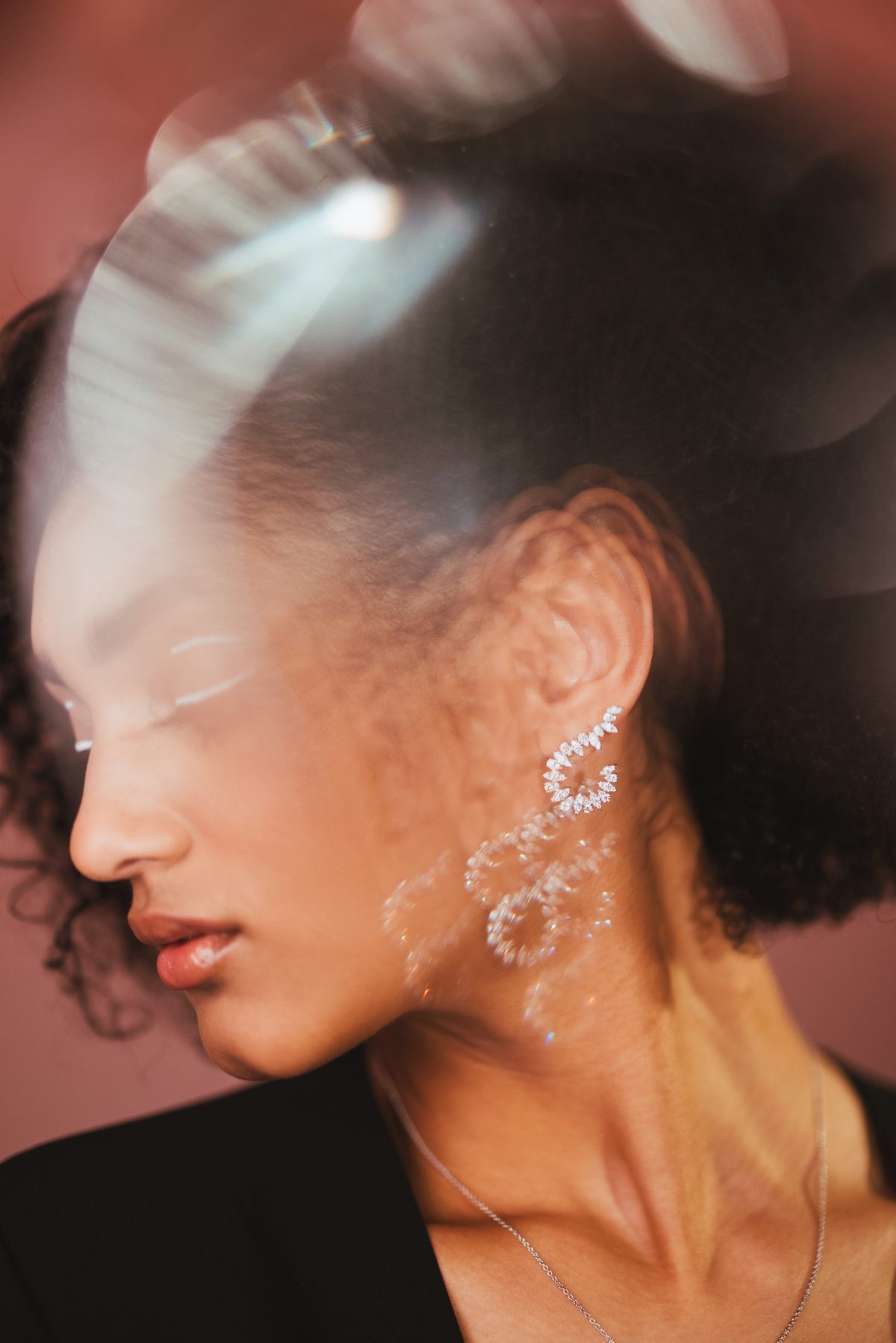
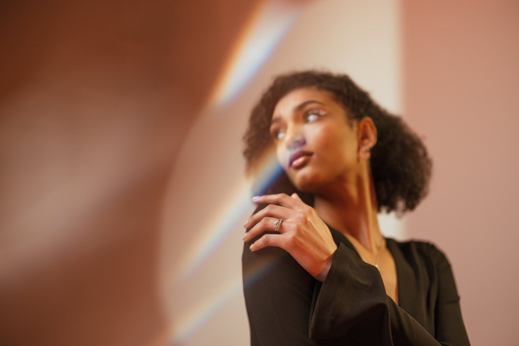
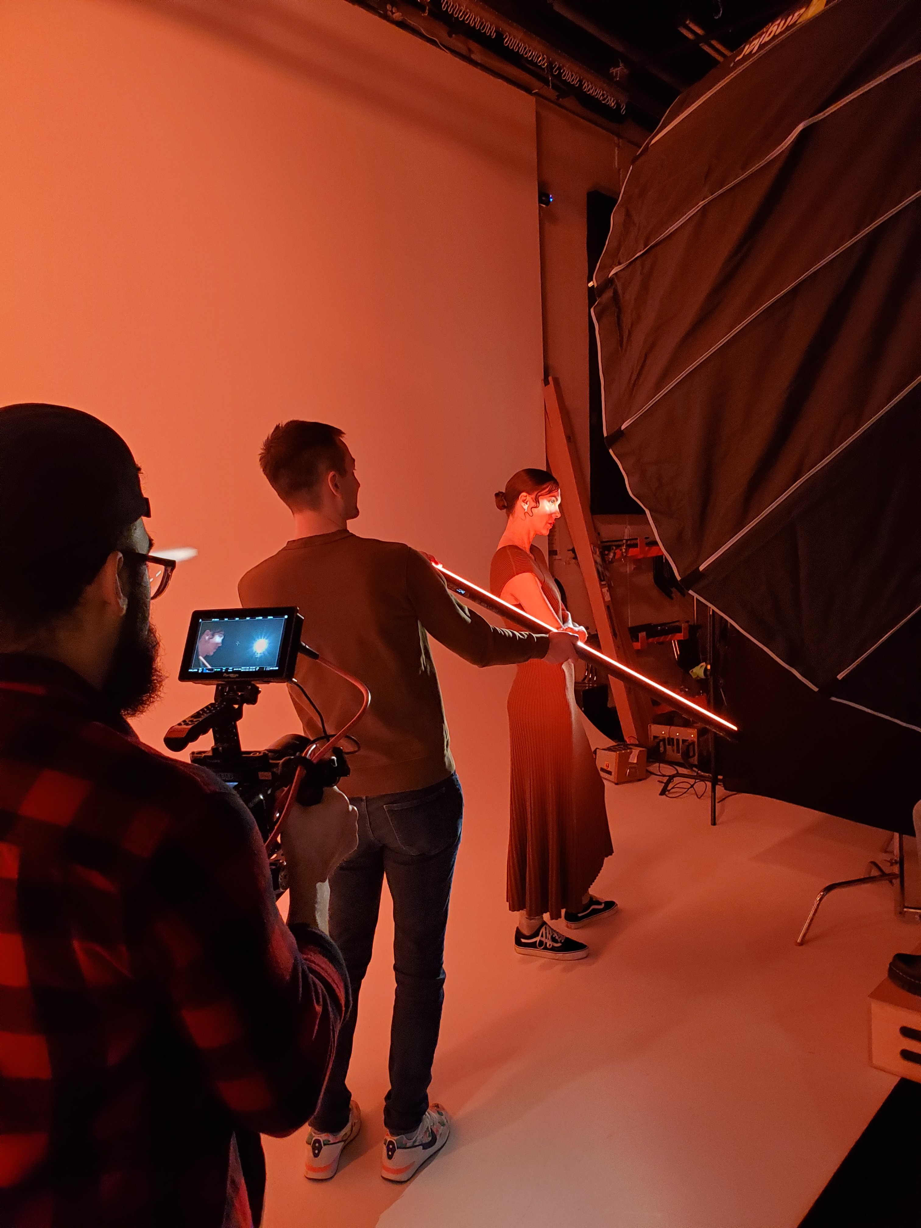
The Excite level of photography is the furthest-reaching expression of the brand. It is meant to draw in new customers with colorful, bold, bright, and experimental photography that sparks interest in their products. We used LED light strips, orb tools to shoot through and create repetition and refraction, and played with shadow to create a look that is as intriguing as it is beautiful, with a range of focus on the jewelry itself.

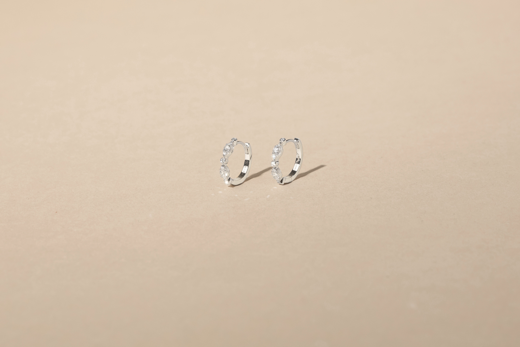
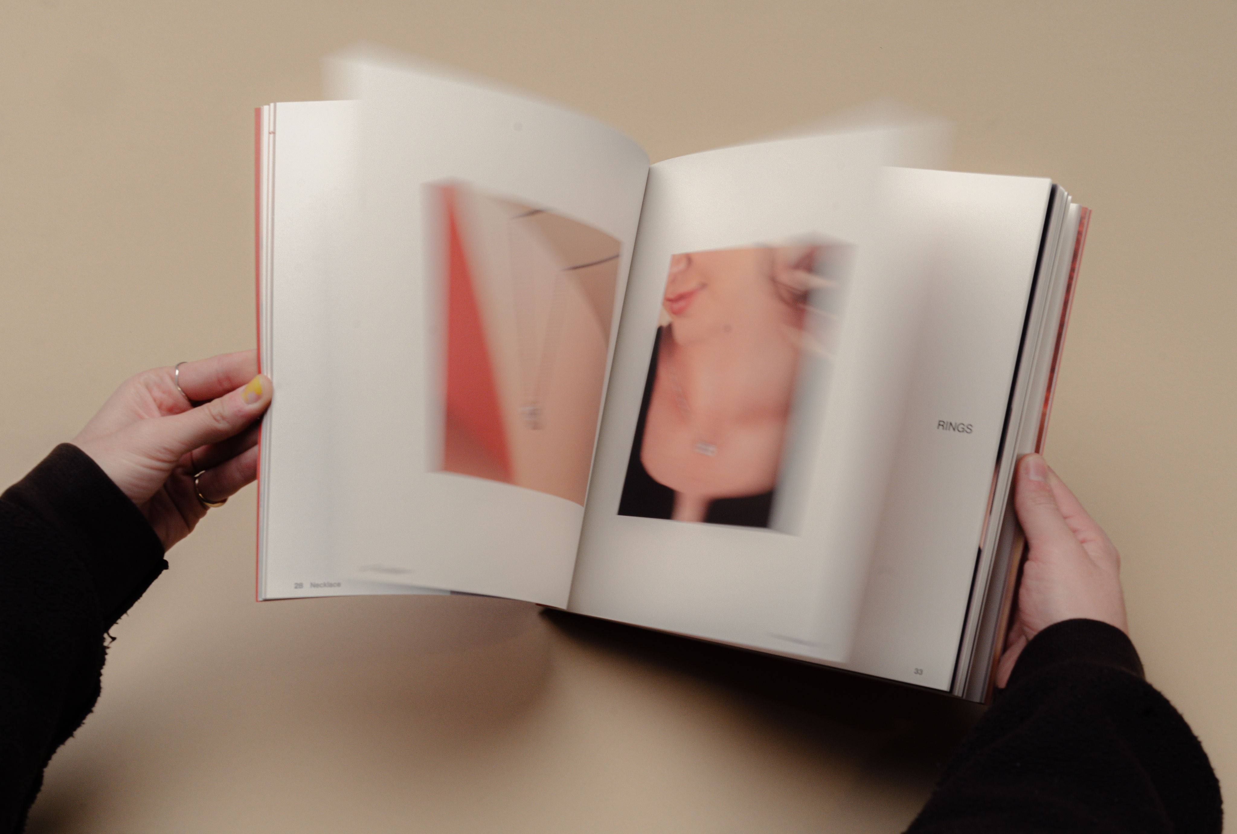
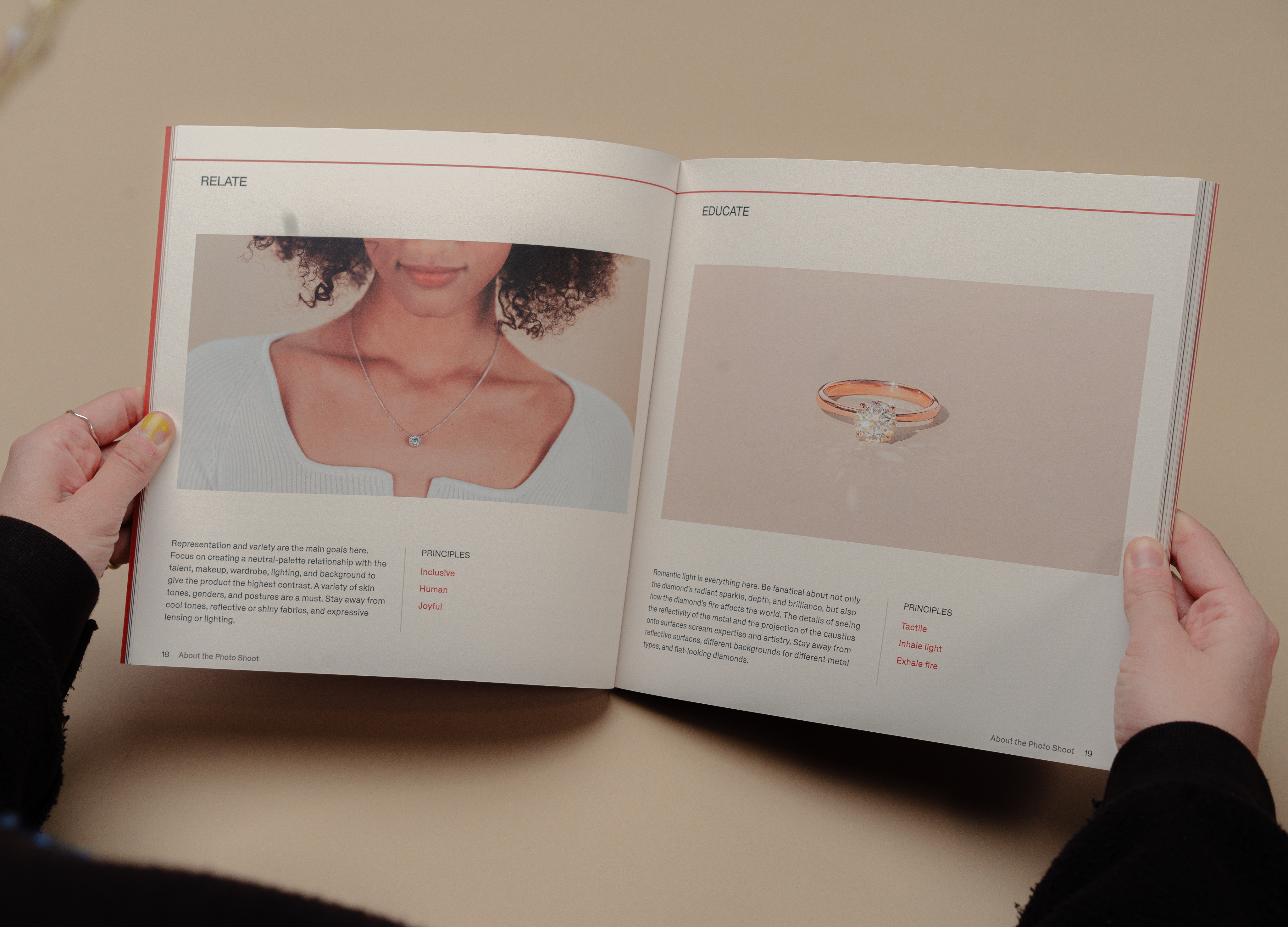
Relate
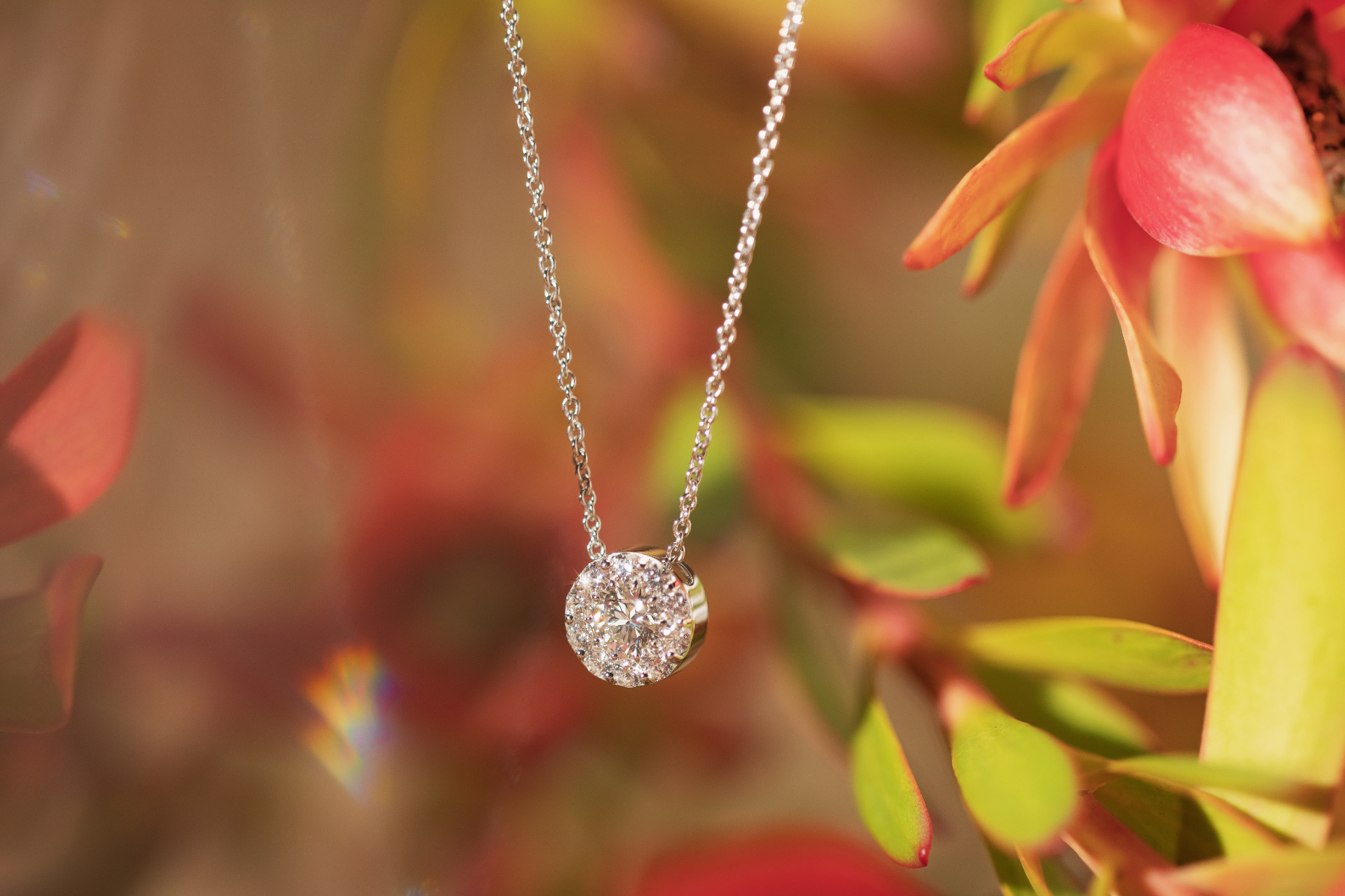
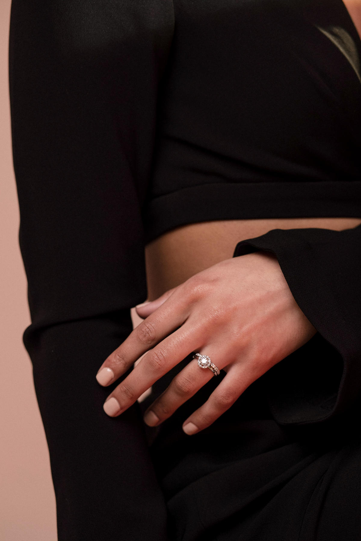
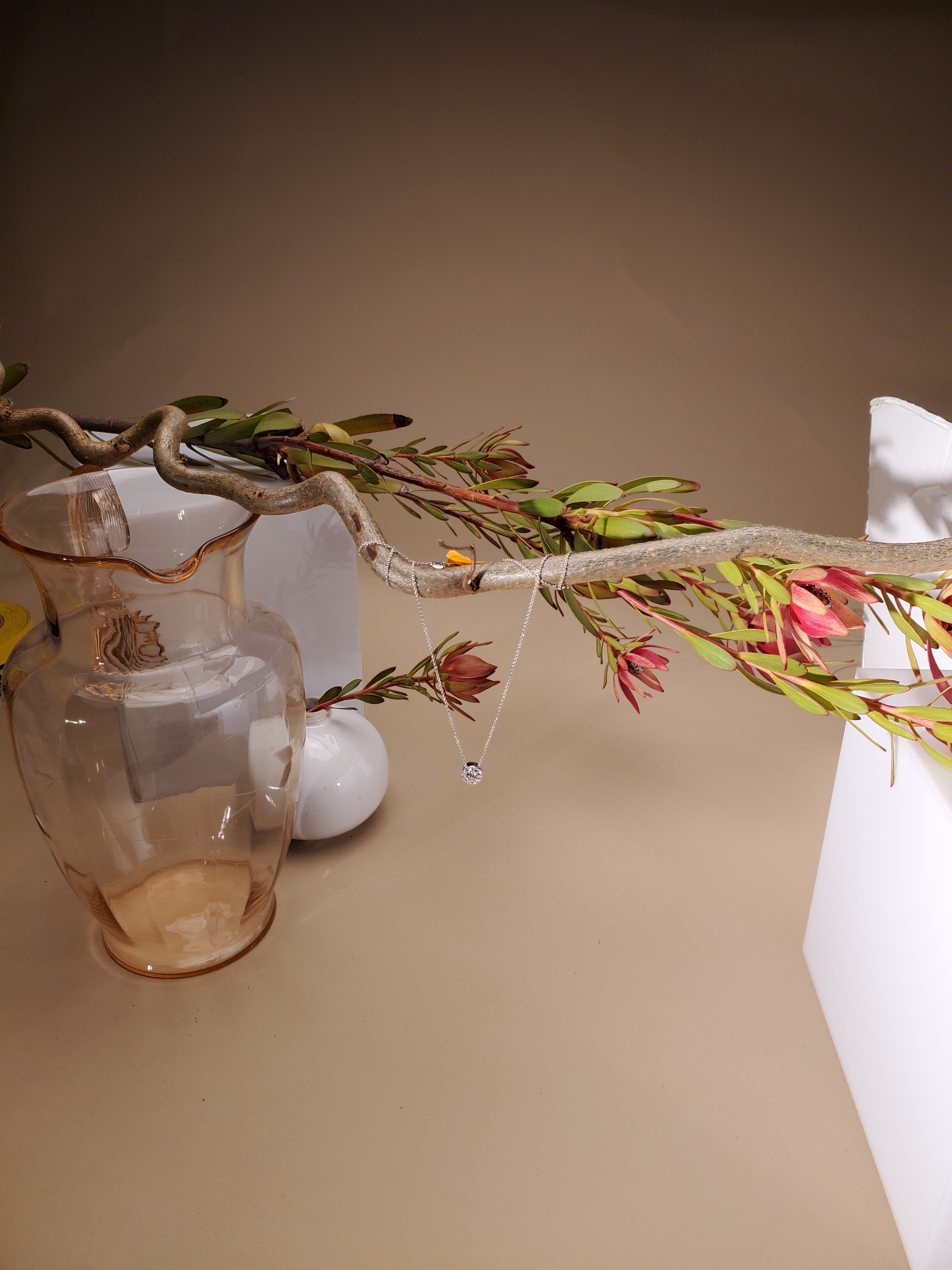
The Relate photography level is closer to the point of purchase. It is meant to be clear, minimal and unobstructed to show the jewelry to-scale and in-use. This level is supposed to help the customer gain confidence in their purchase, even if they can’t physically try the pieces on. These photos live as hover previews on the product menu pages and in the product detail page.
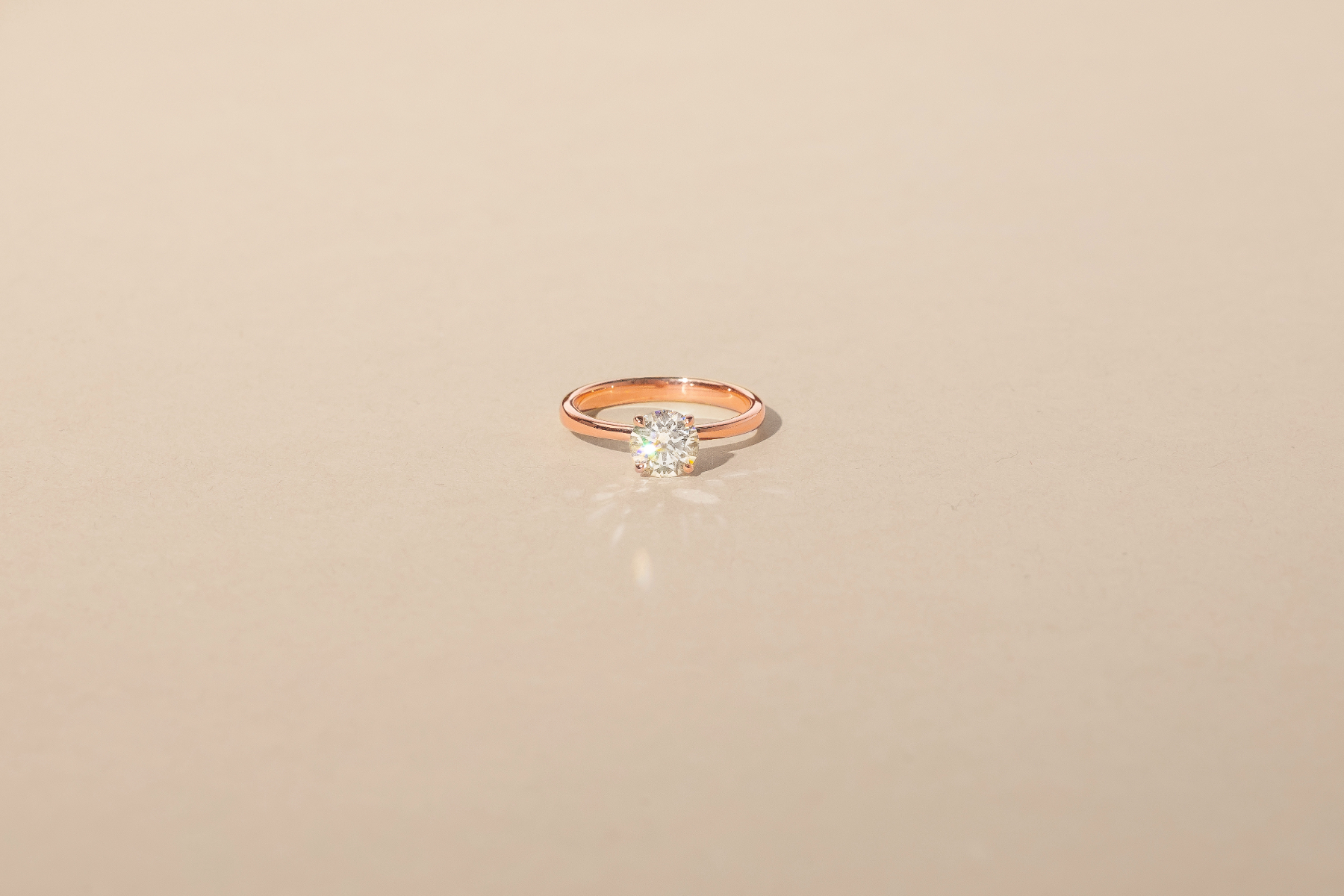
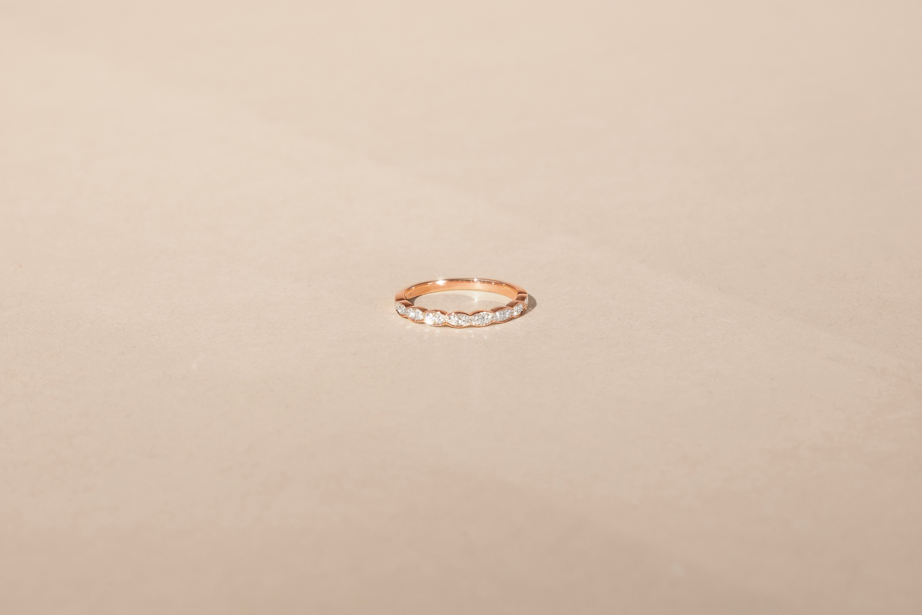
Educate
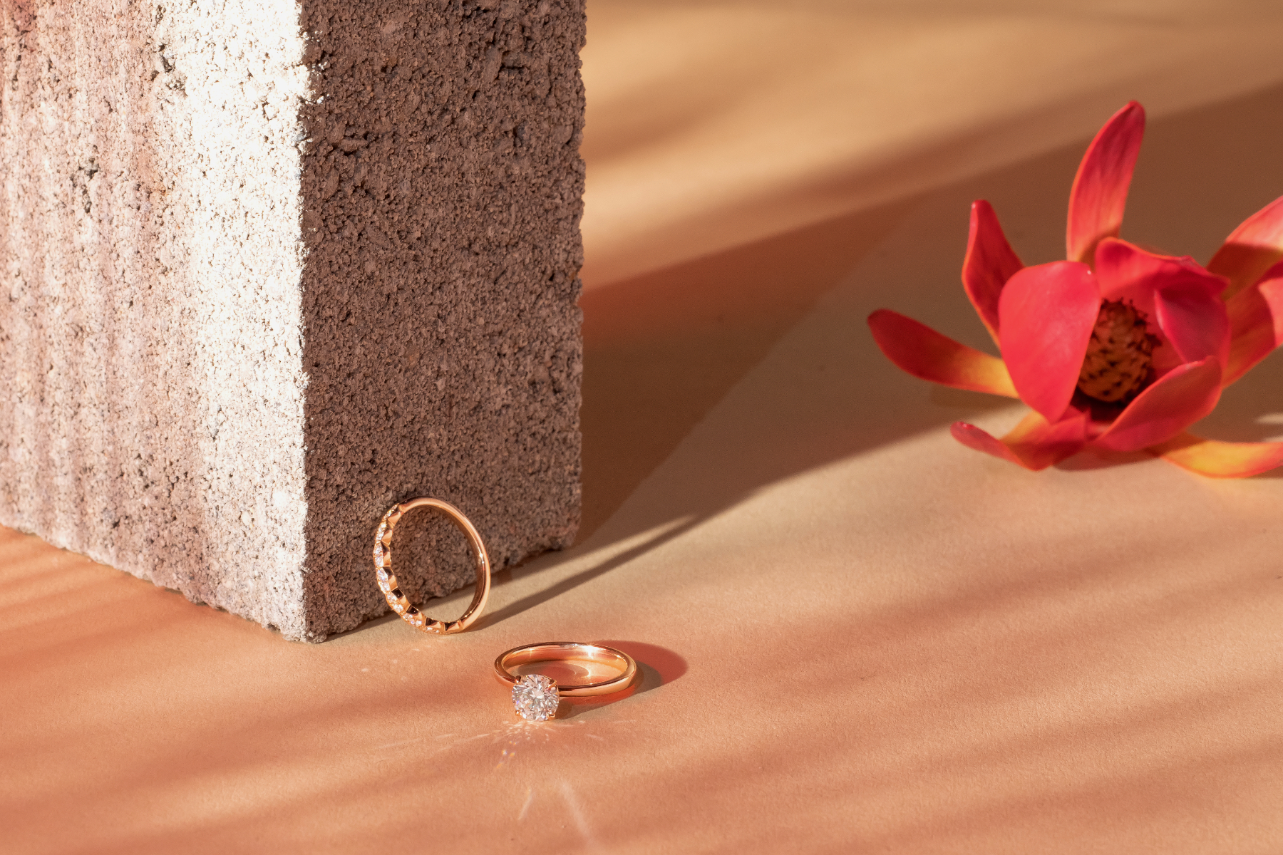
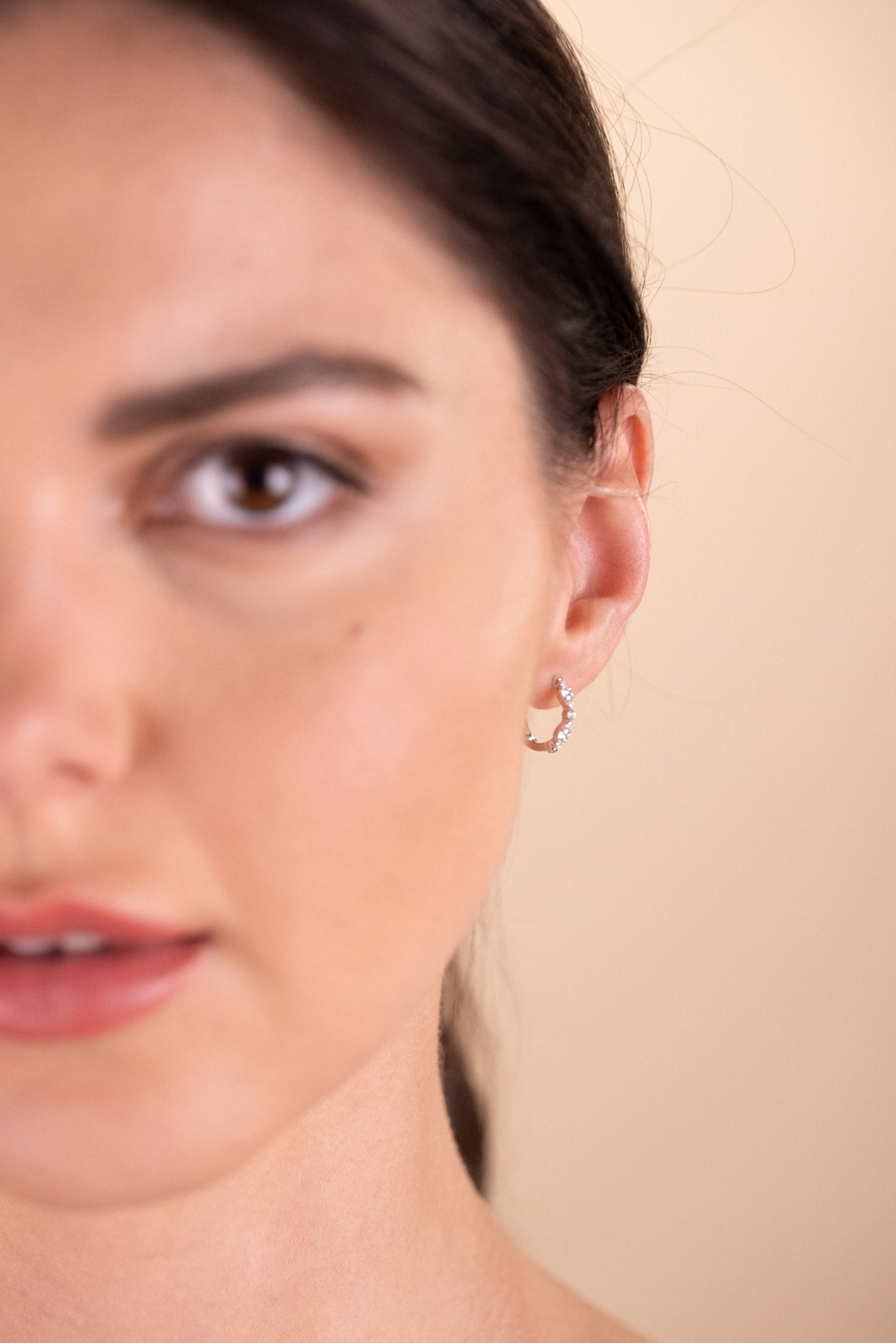
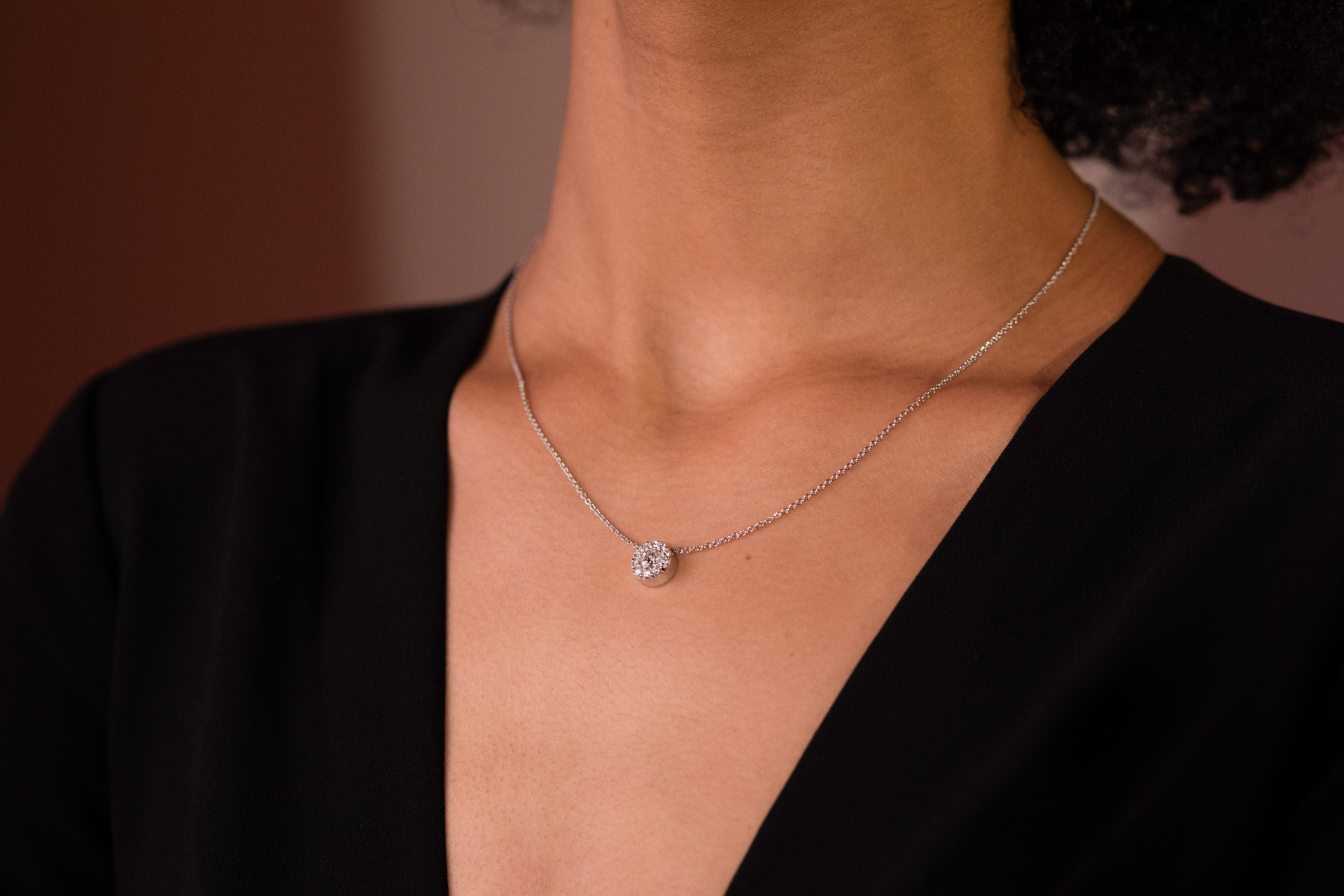
The Educate photography level is closest to the point of purchase and are the main photos on the product detail page. Our goal was to make the jewelry the most beautiful, shiny, and bright it could possibly look. We chose a background that was neutral enough to make all metals of jewelry pop off the page and have an elegant look in the website.


© Elizabeth Mason 2025. All Rights Reserved.
home
contact
honorable mentions
Hearts On Fire
Hearts On Fire is a luxury jewelry company based in Boston. They had come to Indigo Slate looking for a website refresh using their new rebrand. While working on the site, we saw an opportunity to push their photography guidelines, so we staged a test photoshoot and hit the ground running. What resulted was two weeks worth of planning and 3 days experimenting on set, to bring this new angle of their brand to life.
After the photoshoot was finished, we topped it off with an elegant look book that explained our strategic thinking around the photography, and listed the tools and materials we used to make it happen.
See their websiteExcite
The Excite level of photography is the furthest-reaching expression of the brand. It is meant to draw in new customers with colorful, bold, bright, and experimental photography that sparks interest in their products. We used LED light strips, orb tools to shoot through and create repetition and refraction, and played with shadow to create a look that is as intriguing as it is beautiful, with a range of focus on the jewelry itself.
Relate
The Relate photography level is closer to the point of purchase. It is meant to be clear, minimal and unobstructed to show the jewelry to-scale and in-use. This level is supposed to help the customer gain confidence in their purchase, even when they can’t physically try the pieces on. These photos live as hover previews on the product menu pages and in the product detail page.
Educate
The Educate photography level is closest to the point of purchase and are the main photos on the product detail page. Our goal was to make the jewelry the most beautiful, shiny, and bright it could possibly look. We chose a background that was neutral enough to make all metals of jewelry pop off the page and have an elegant look in the website.

© Elizabeth Mason 2025. All Rights Reserved.